A Touch of Adventure: Rivian HMI Redesign
UX Design
UI & Motion Design
Design Systems
Automotive Inteface Design
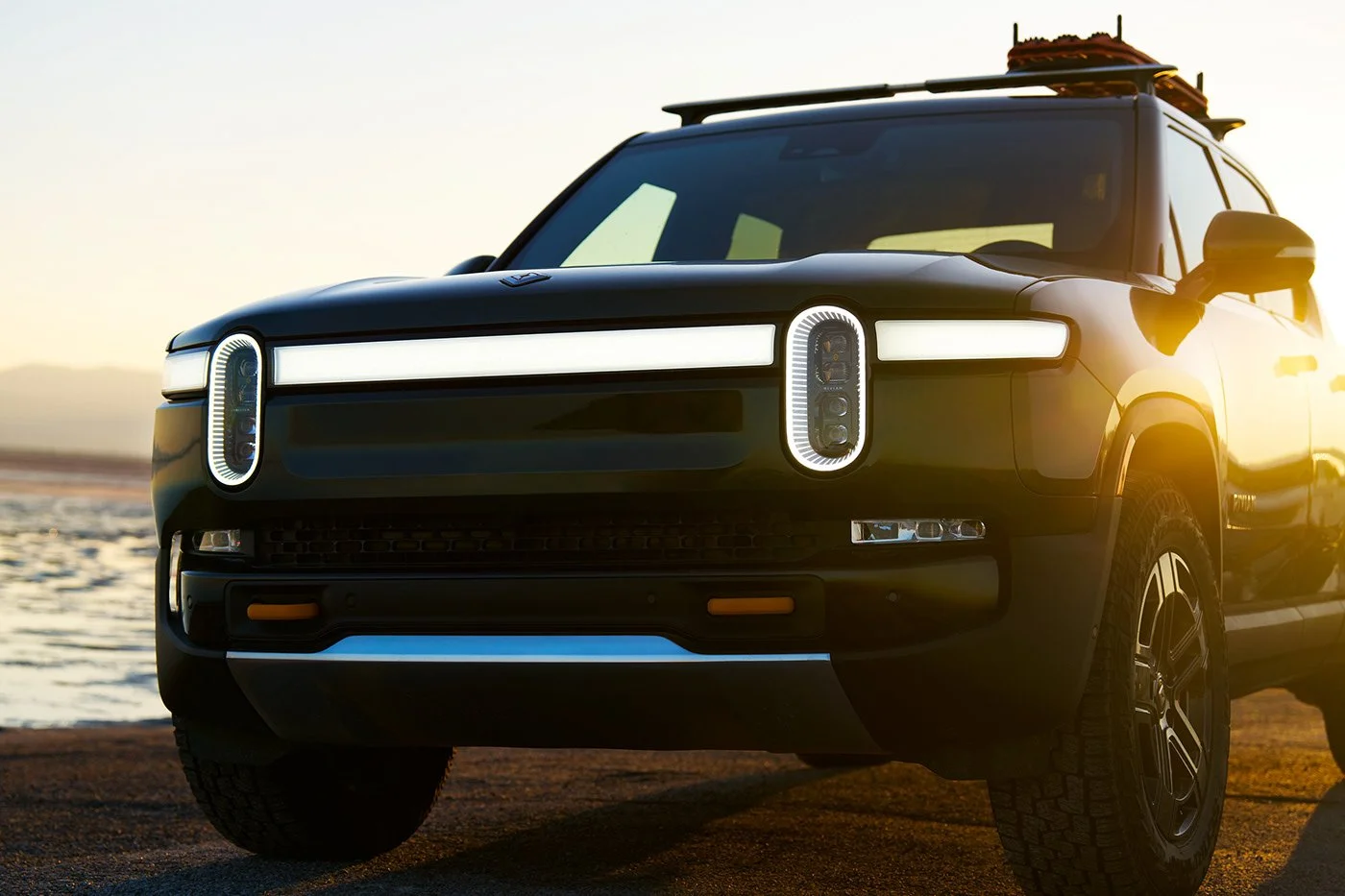
Teaser
Keyshot Studio
Figma
3D Animation
Rhino
Project Overview
This project started out as a fun exploration of Rivian’s brand identity through visual design, but quickly grew into a more interesting challenge: finding ways to blend good looks with real functionality.
I looked for design opportunities to improve the connection between digital tools and practical needs, aiming to make the off-roading experience even better for Rivian’s drivers.
My Role
Product Design and Research, 3D model Design and Animation
Tools Used
Figma, Rhino, Keyshot Studio, Adobe Premiere
Duration
4 months
Problem Statement
Bridging the Gap Between Brand and Interface
Rivian’s current interface is clean, user friendly, and works well. There are design elements that reflect the brand’s adventurous side, mainly on the center screen. The cluster screen leaned more utilitarian than expressive, which makes sense from a usability standpoint.
That said, I wanted to explore the brand identity more fully and bring it into both the visuals and the experience. This redesign was a chance to look closer at how the interface could better support how Rivian drivers actually use the vehicle, not just as a daily car, but as a tool for exploration.
Rivian, the brand
What the Rivian brand stands for
Rugged, outdoorsy, adventurous, forward-thinking
Not just an EV, a vehicle designed for trails, camping, and exploration
Rivian’s brand is rooted in exploration. From the compass-inspired logo to their trail-focused marketing, the identity is built around adventure, capability, and connection to nature. That energy didn’t fully carry over into the current interface, which leaned more neutral and clean.
I used that gap as a starting point for the visual direction. I brought in topographic shapes, compass motifs, and fluorescent accent colors pulled from outdoor tools. The goal was to let the visuals support the experience, to feel functional and familiar to off-road drivers, while still clean and easy to use.
Design
Rivian, the Redesign
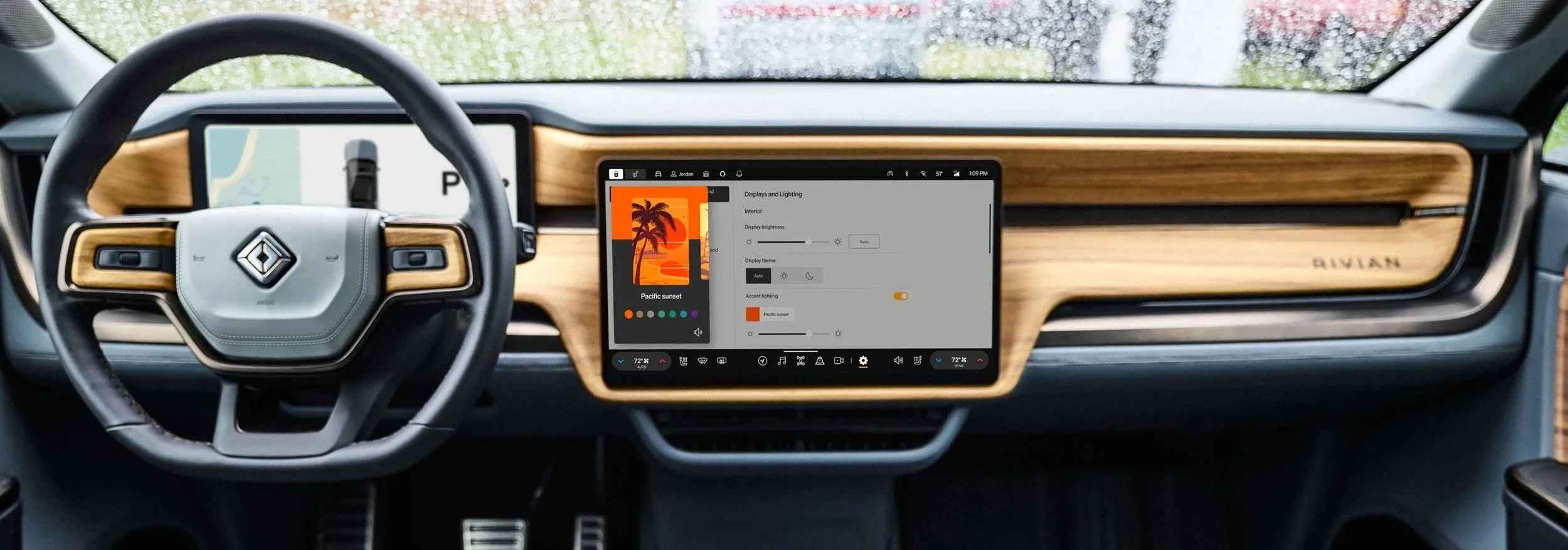
I decided to create three modes for the redesign, to support different environments and make the interface easier to use in a range of driving conditions: Light, Dark, and Terrain.
The Terrain Mode was designed to give faster, more focused access to off-roading features. I didn’t originally plan for a “Terrain - Dark” variation, but added it later to keep visibility consistent in low-light or nighttime conditions, especially when driving off-grid
Design System
The only logical next step to better execute the Mode Switch feature and also to make any changes as the project processed, was to build a design system with consistent UI elements and token-based styling.
Design - ICS
Mode Switch
Having Light and Dark modes is common practice in automotive interface design, but Terrain Mode goes further. It provides easier access to certain functions and introduces features that support off-road driving.
The gateway to the Terrain Mode in the toggle button at the bottom center of the screen. Once the Mode Switch is activated, new functions appear on the screen:
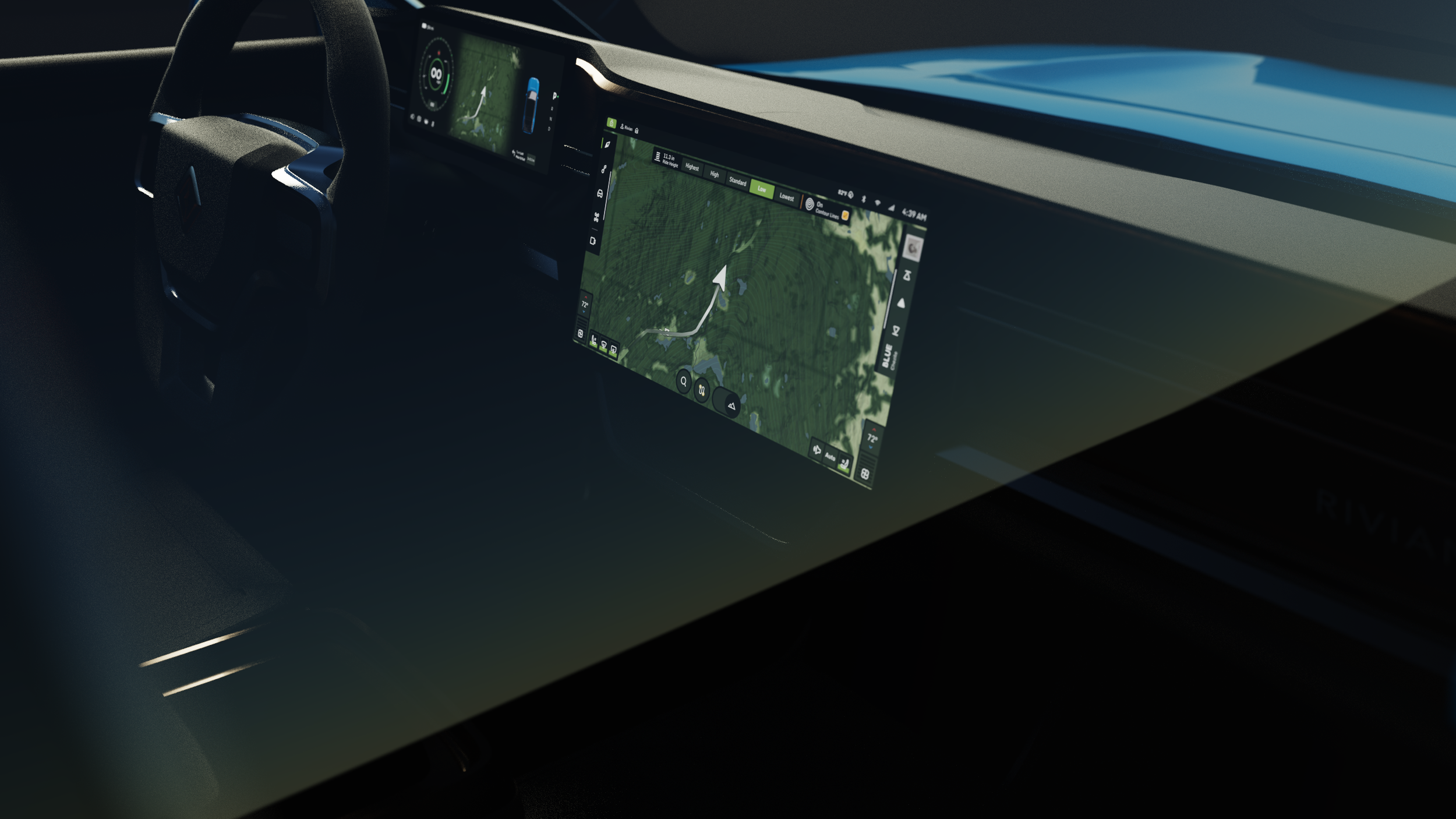
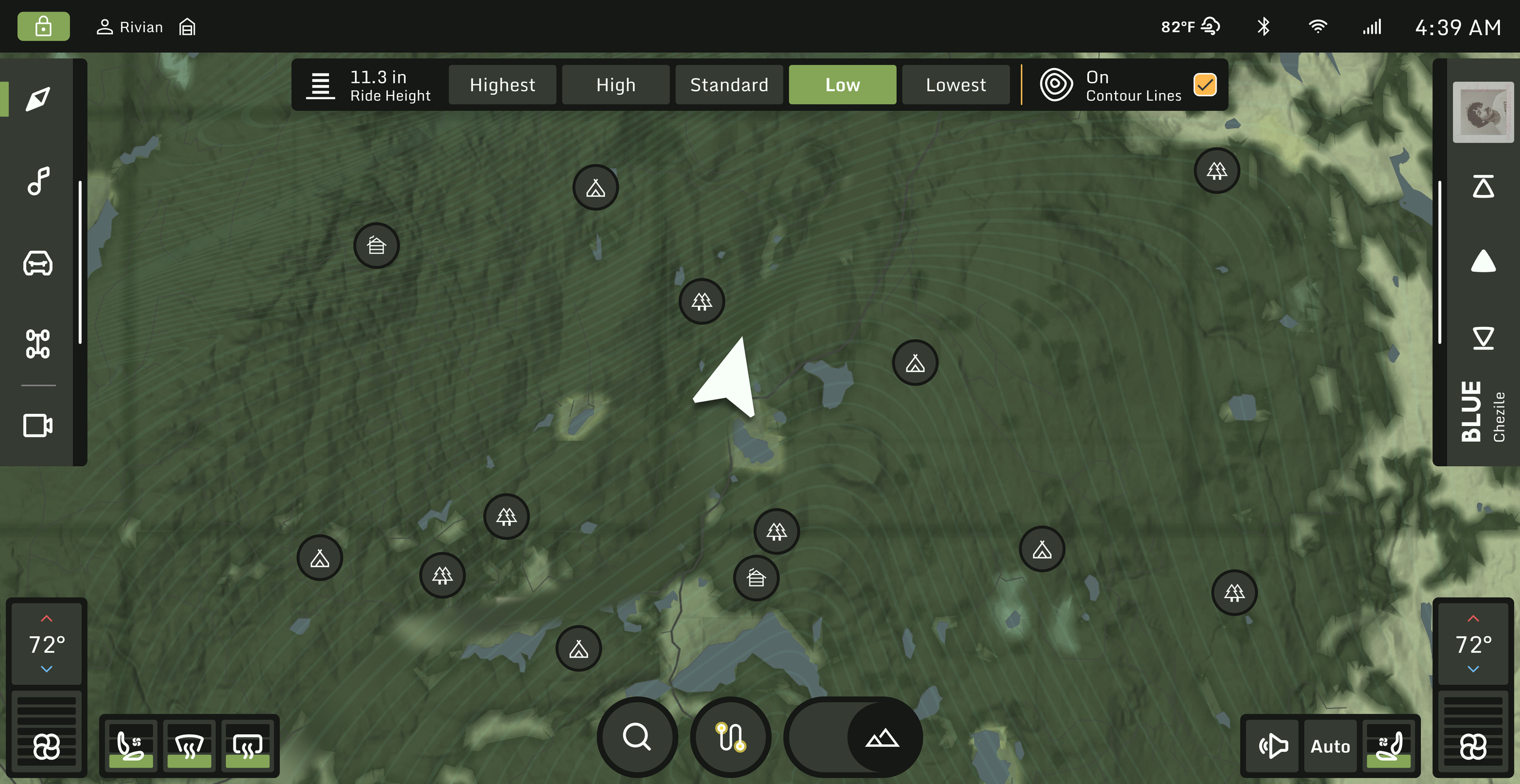
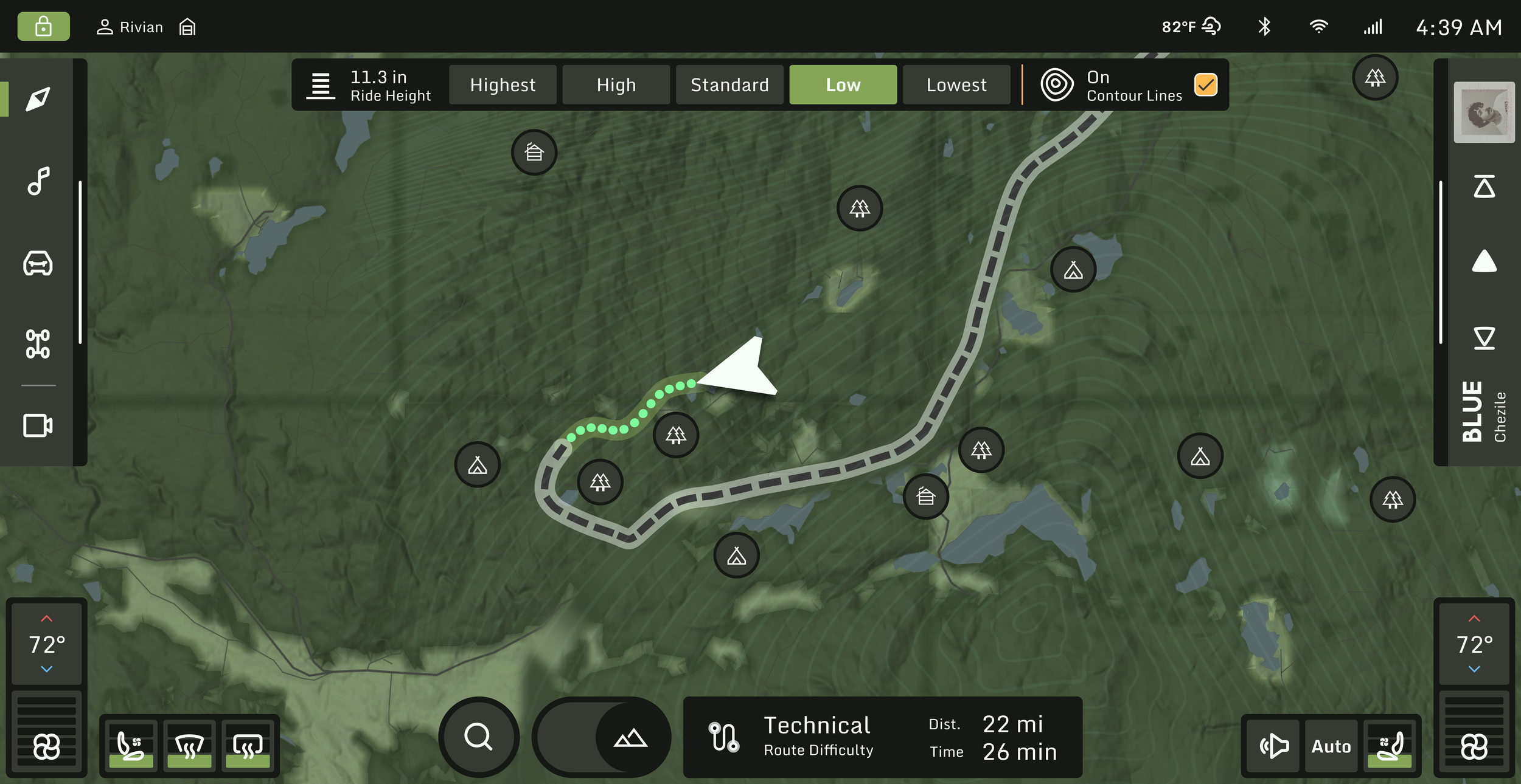
Ride Height & Topographic Lines
A quick access panel appears at the top of the screen, allowing drivers to adjust ride height without leaving the map. This panel also includes a toggle for topographic lines, helping drivers better understand elevation changes along their route.
Points of Interest (POIs)
Once Terrain Mode is active, the map surfaces nearby points of interest — including campsites, cabins, and other relevant off-road destinations. Drivers can tap on a POI to get directions directly to that location.
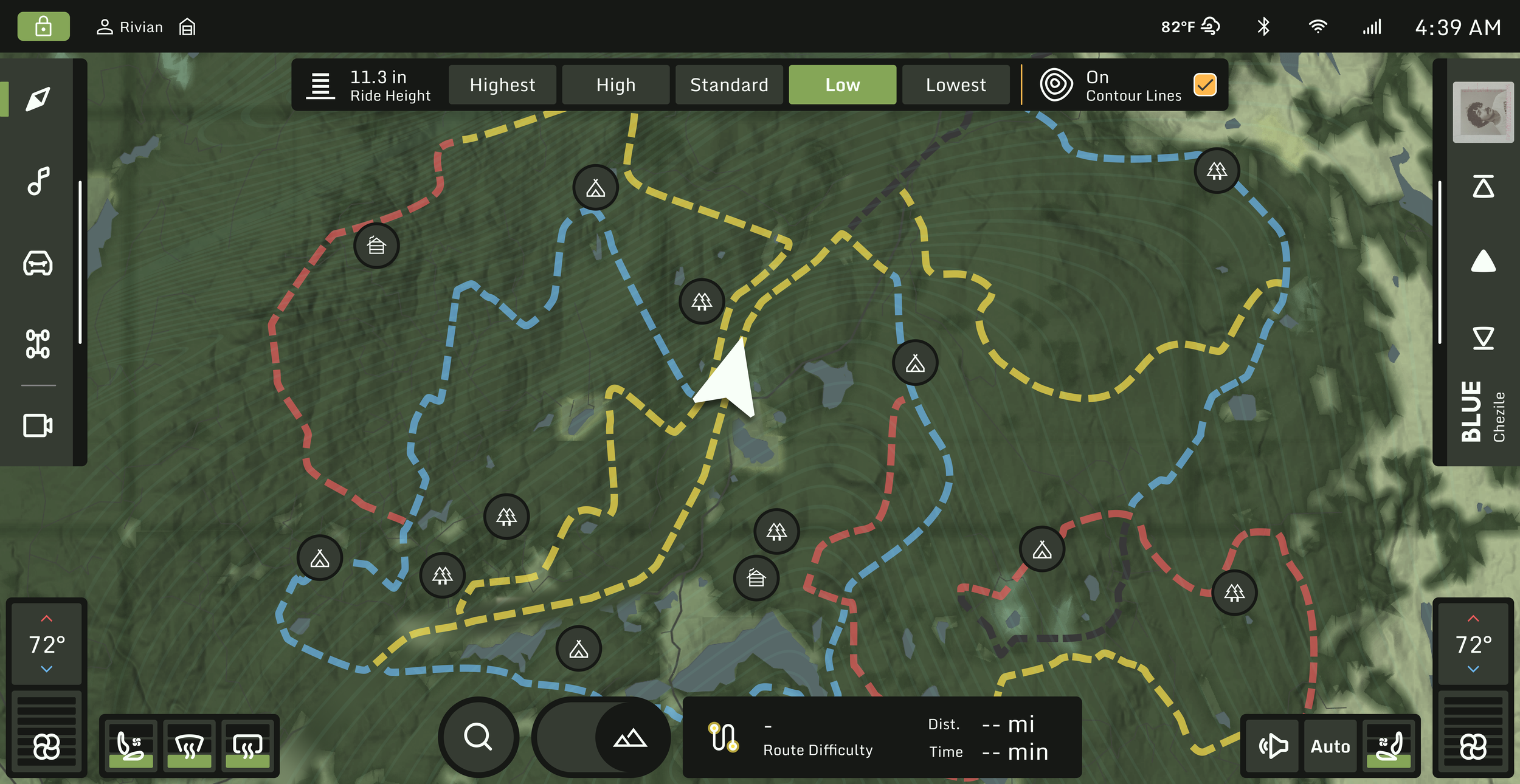
Route & Search Buttons
These buttons help drivers explore trail routes and filter by difficulty or distance. Route discovery is covered in more detail in the next section.
Terrain Mode, Choosing a Route
In Terrain Mode, drivers can explore and choose routes in three different ways:
On-Screen Select:
Explore Routes
Tapping the Route button reveals nearby trails on the map. The Route button turns into an info box showing information like route difficulty, distance, and drive time.
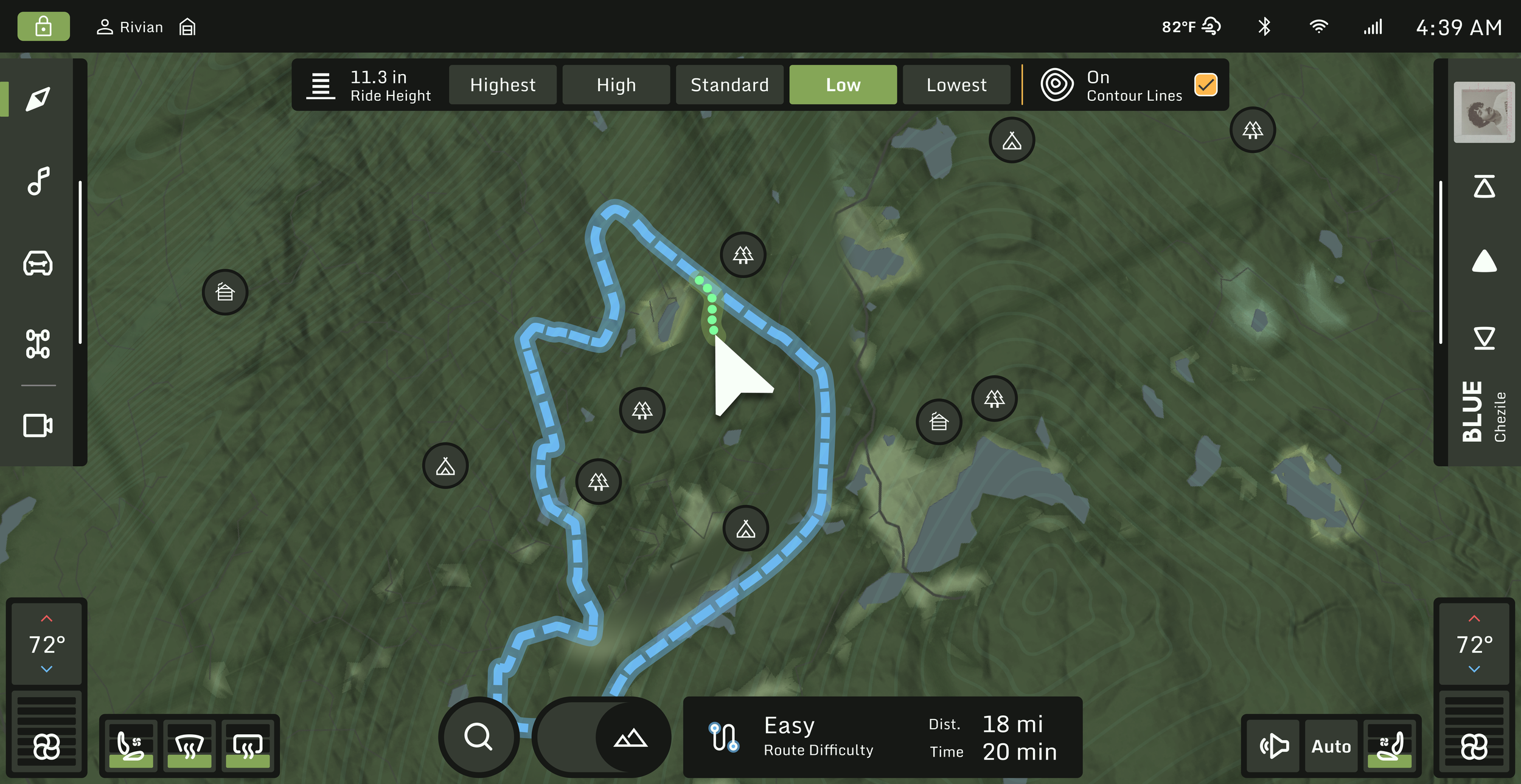
Compare Routes
Each route is color-coded, different colors indicate different difficulty levels, giving drivers a quick visual reference before making a selection.
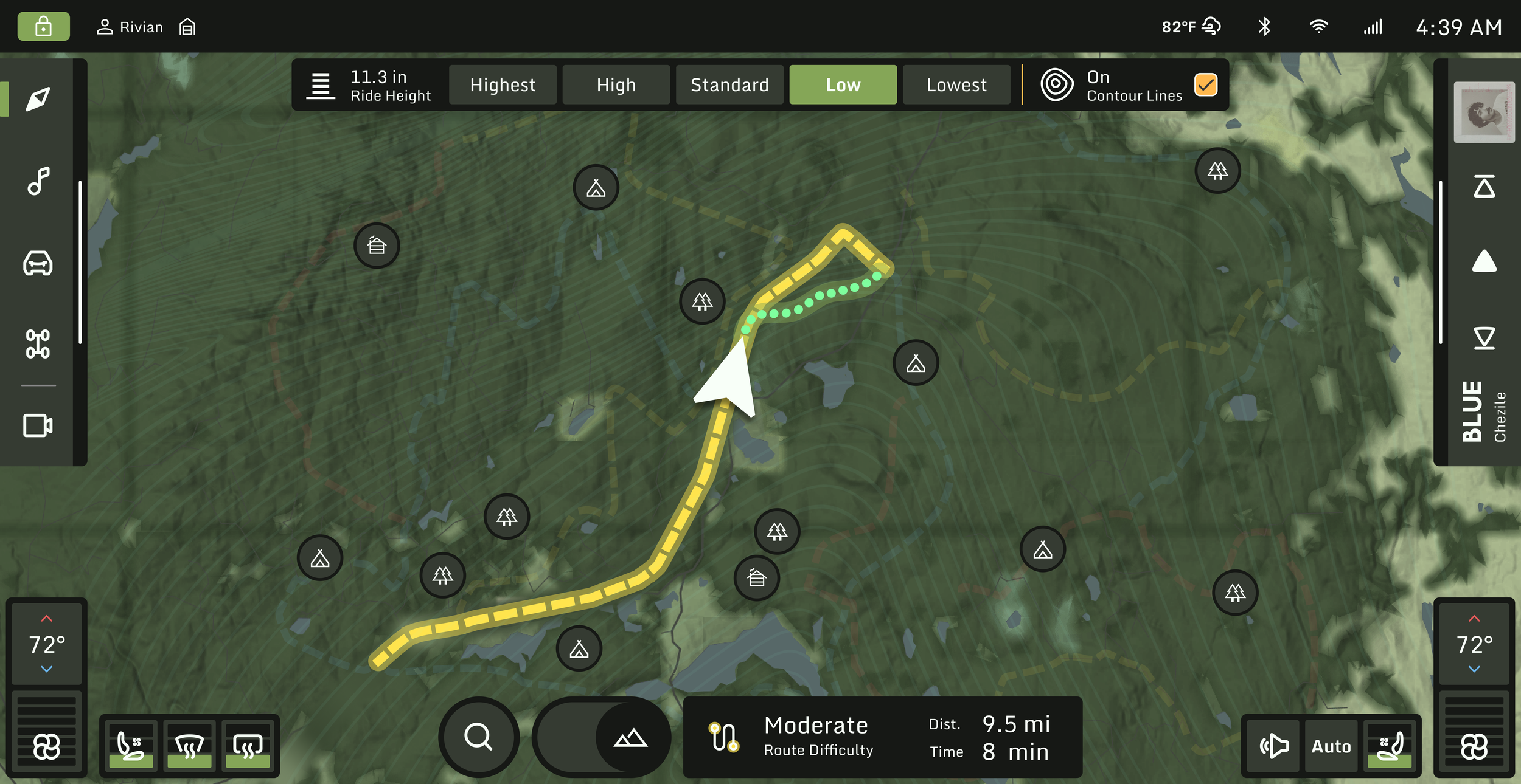
Select and Navigate
After a route is selected, the map gives direction to the starting point of the route.
Search by Name:
Select and Navigate
After a route is selected, the map gives direction to the starting point of the route.
Go for Direct Search
This method is helpful when the user already knows the name of a route or wants to jump directly to a location without browsing the map.
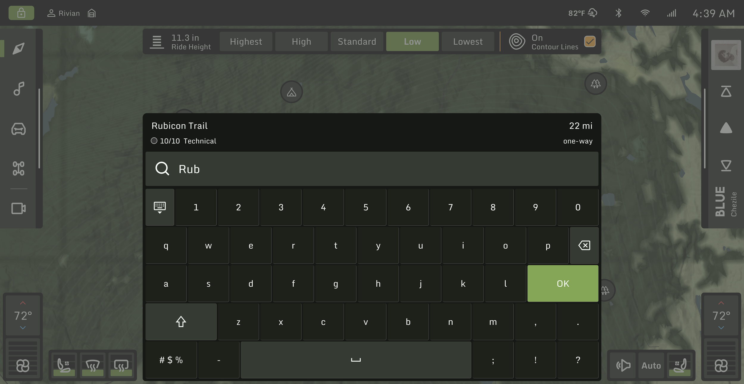
Type the Destination
Search by Filters:
Explore with Filters
In the search field, user can filter nearby routes by difficulty level and mileage, and they can also access saved map from here.
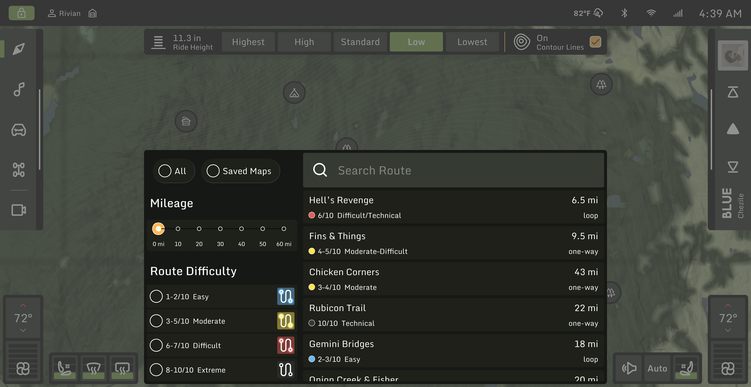
Select and Navigate
After a route is selected, the map gives direction to the starting point of the route.
Interface in Action
Map to Media
Drive Mode
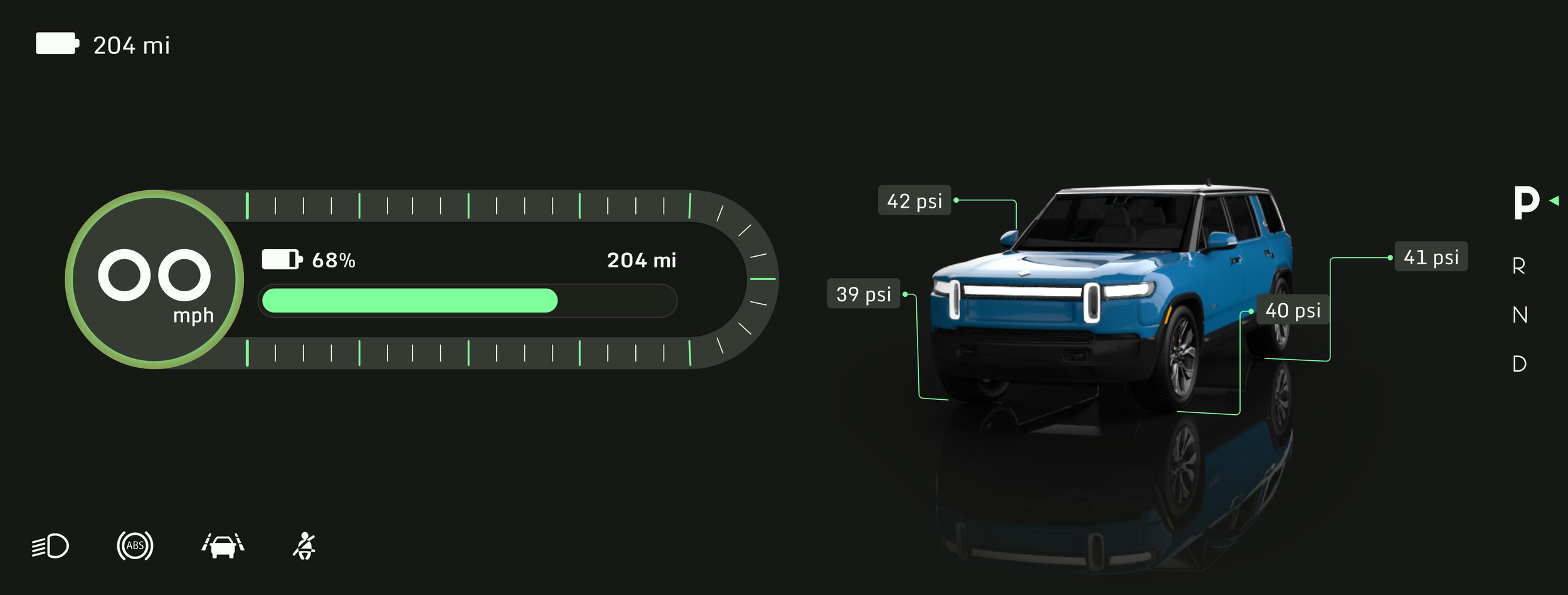
Design - Cluster
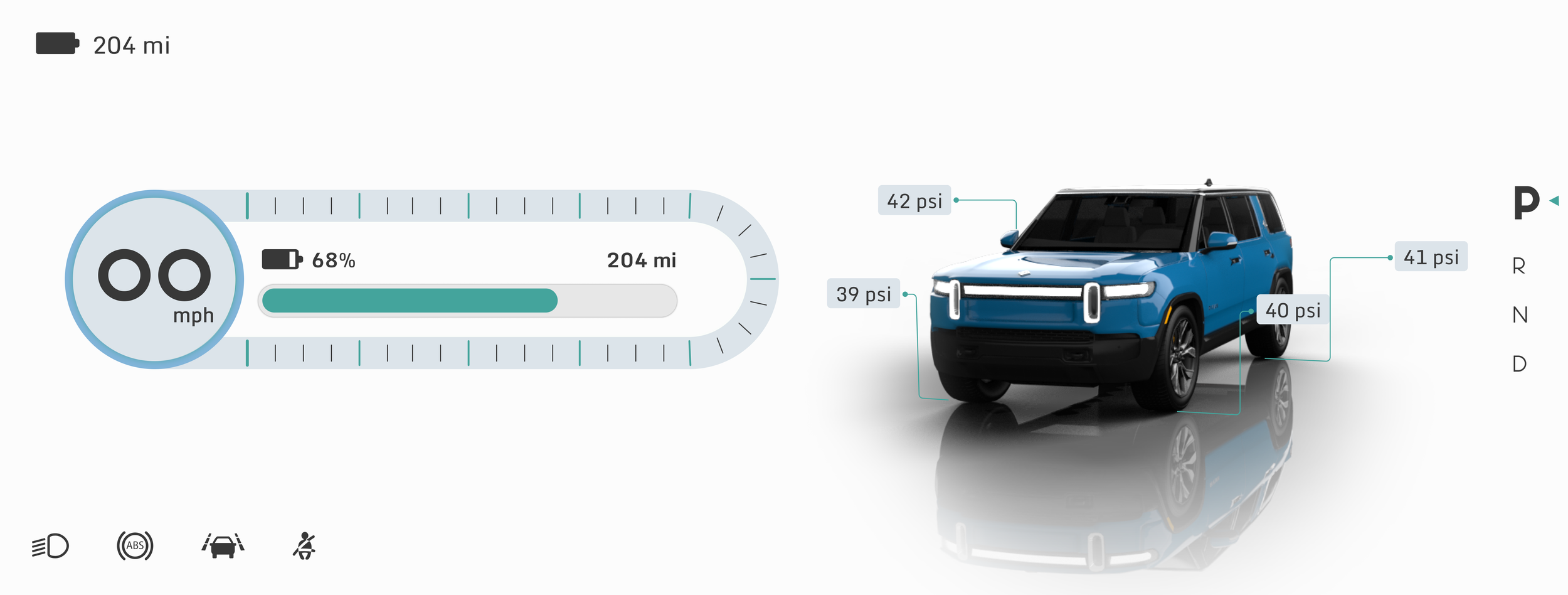
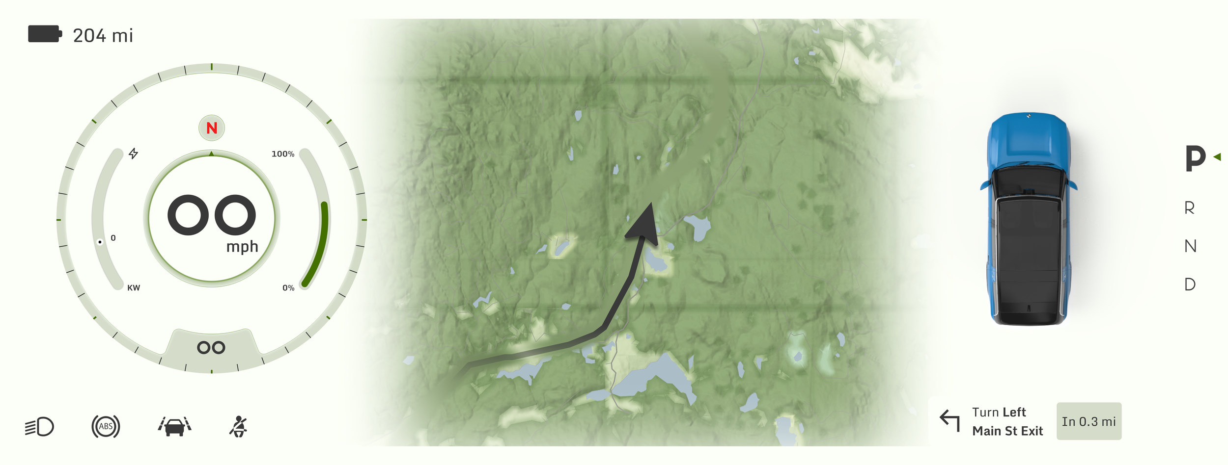
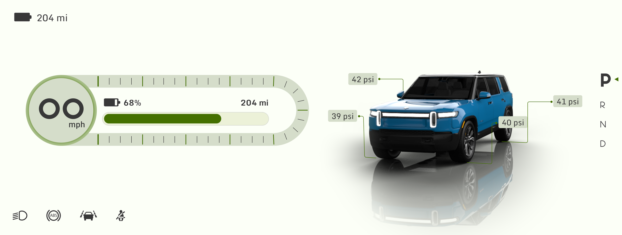
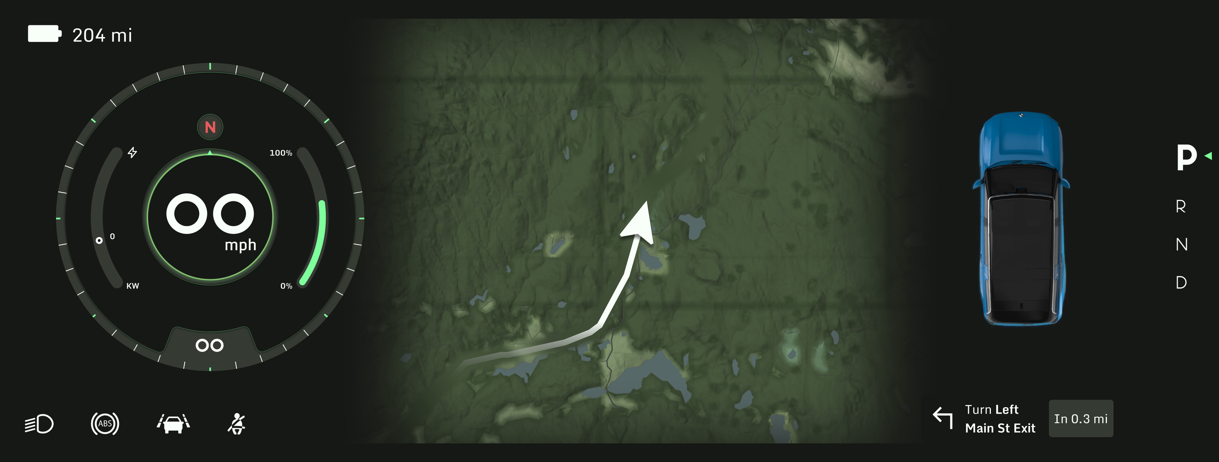
Cluster Views
The cluster has two versions. The default view has a more detailed speedometer with motion and compass inspired elements built into the design. This view also has the map view, turn by turn guide, and the 3D driving visualization.
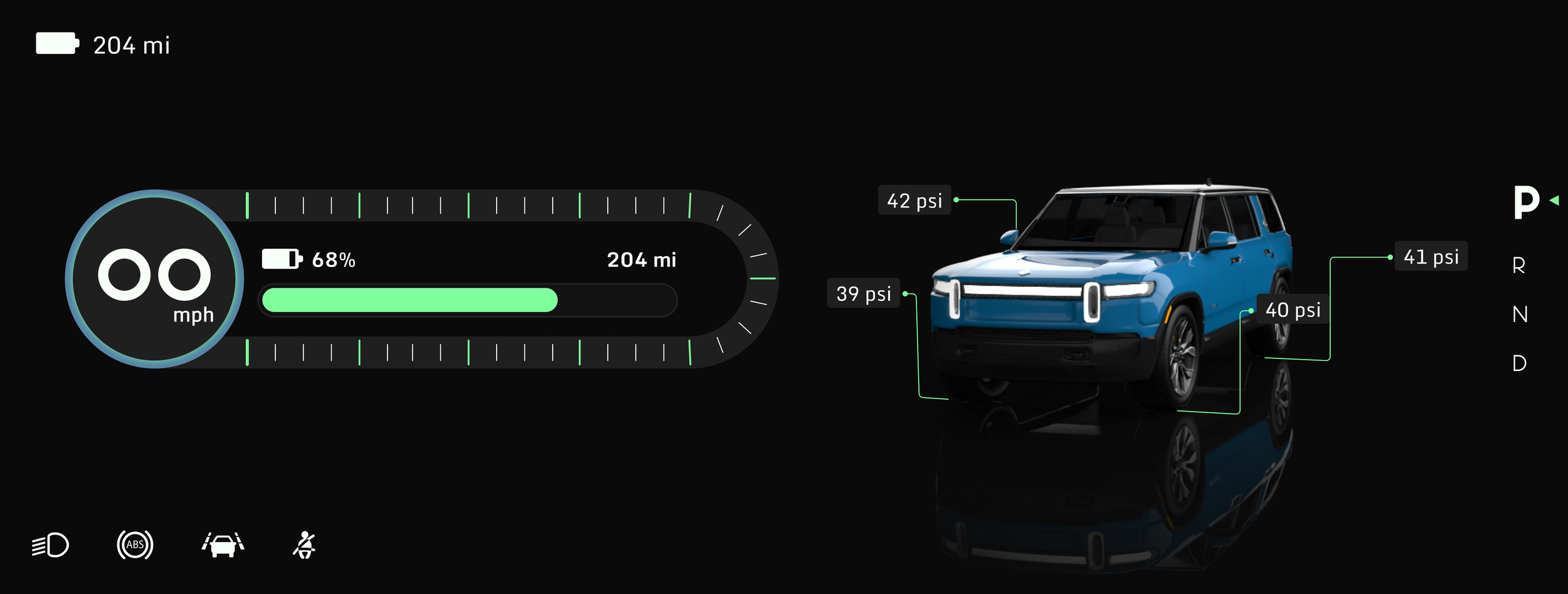
The simplified view keeps the same overall style but removes extra motion and focuses on the key visuals.
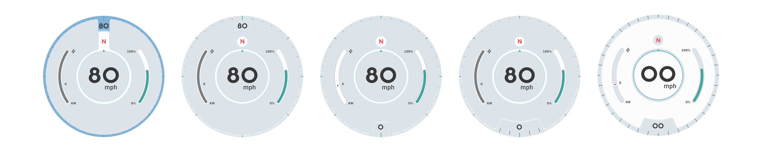
I wanted to integrate compass elements into the speedometer without letting them clash with the speed reading or make the motion feel too busy. The iterations focused on finding a balance between movement, legibility, and visual rhythm.
I experimented with layering, sectioning, and motion balance to keep the speedometer visuals clear but dynamic.
Speedometer Iteration
Speedometer in Motion
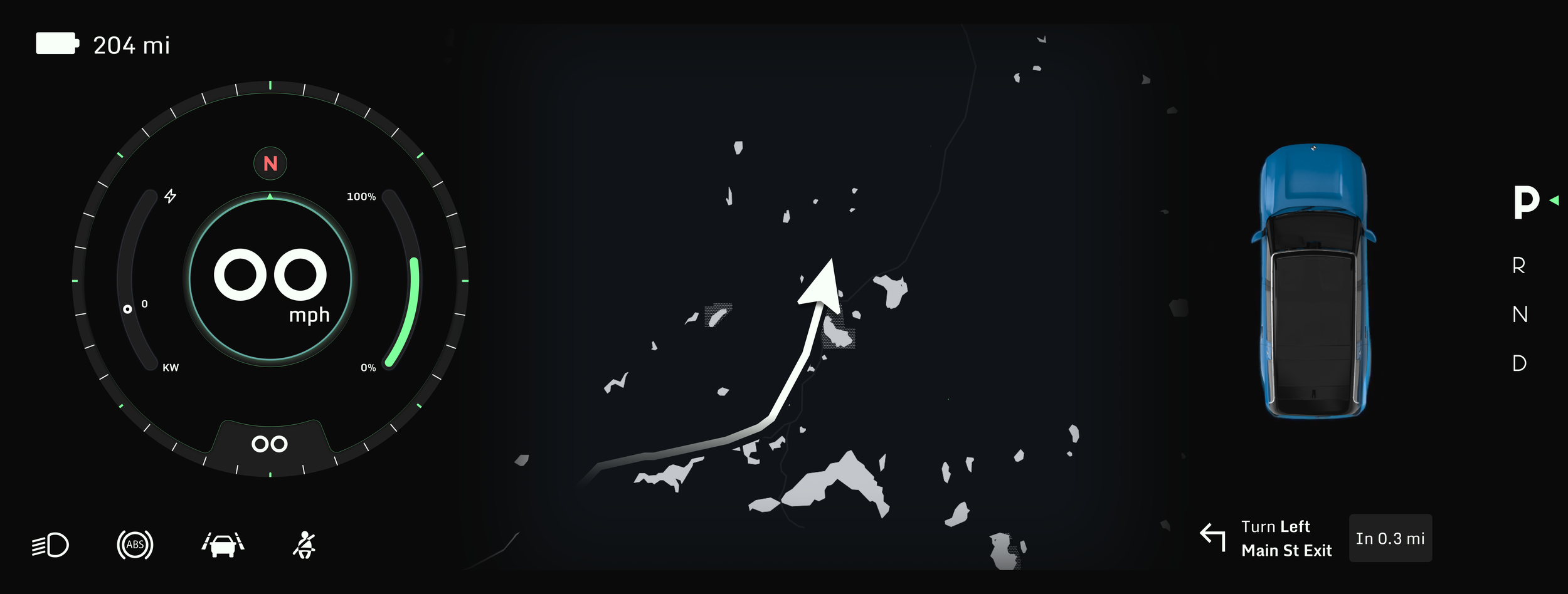
Dark Mode
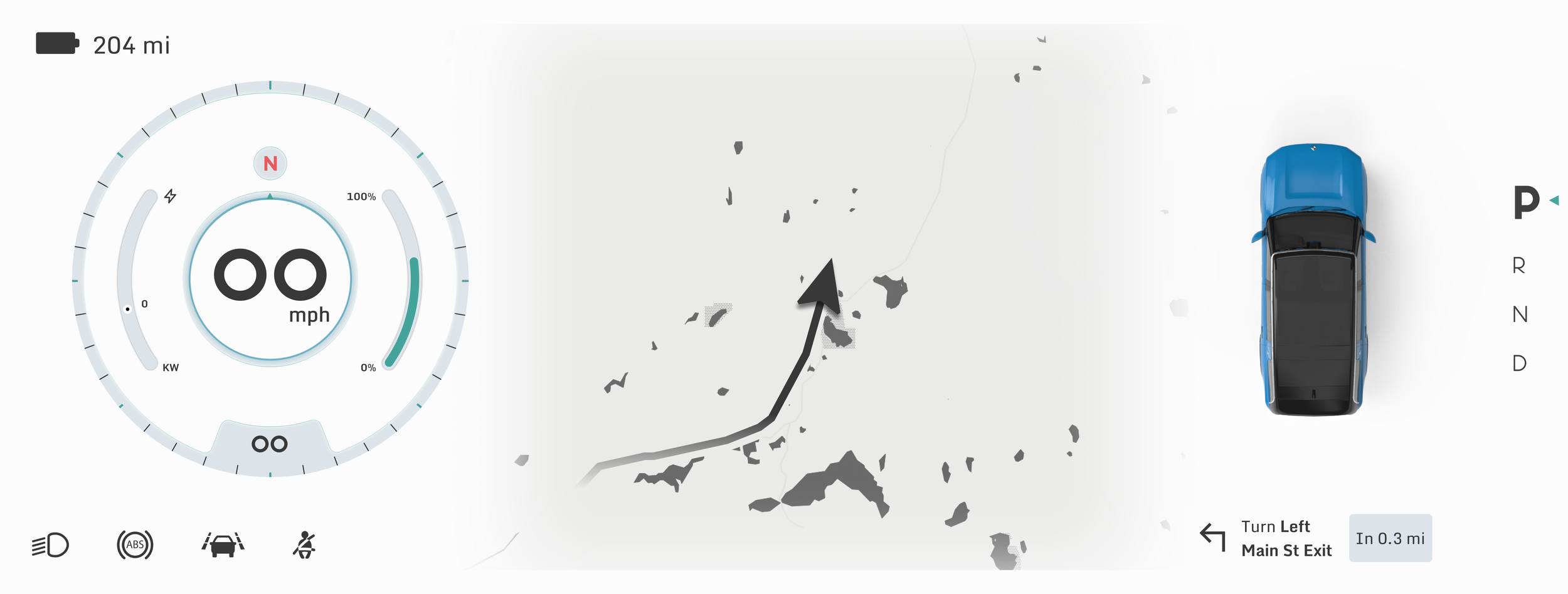
Light Mode
Terrain Mode - Light
Terrain Mode - Dark